Frontend-Projects
#Testimonials Grid Section
A responsive Testimonials Grid Section built with HTML and CSS as part of a Frontend Mentor challenge.
Overview
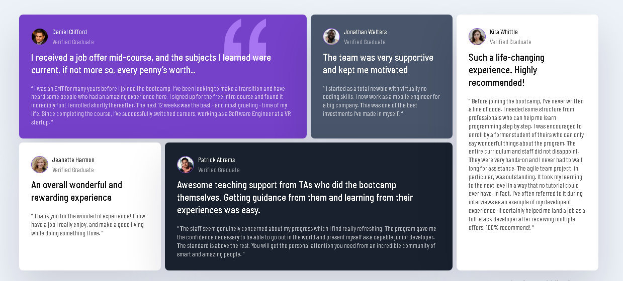
This project recreates a testimonials grid layout featuring five customer testimonials. The design uses CSS Grid to create a responsive desktop layout and adapts to a single-column layout on smaller screens.
Features
-Responsive layout for desktop and mobile screens -CSS Grid for the main layout -Custom Google Font — Barlow Semi Condensed -Individual testimonial cards with different background colors -Profile images and verified status
Built With
HTML5, CSS3, CSS Grid, CSS Media Queries, Google Fonts
Screenshot
While building this project, I practiced:
-Creating complex layouts with CSS Grid -Positioning elements across multiple grid columns and rows -Creating responsive layouts with media queries -Styling reusable testimonial cards with CSS -Working with local images and external fonts -Structuring HTML for a multi-card interface
Responsive Design
The desktop version uses a multi-column CSS Grid layout. At smaller screen widths, the cards are rearranged into a single-column layout to improve readability and usability on mobile devices.
Acknowledgments
This project was completed as part of a challenge from [Frontend Mentor] (frontendmentor.io/challenges).
Challenge: Testimonials Grid Section
Frontend Mentor provides professional designs and challenges that help developers improve their frontend development skills.
License
This project was created for learning and practice purposes.